JDeveloper: JavaScript Digital Clock in a Fragment

This post is about a combination of best practices combined together. The best practices are the UI-Manager pattern (The UIManager Pattern | The Groundside Blog by Duncan Mills), using JavaScript in a fragment (Gotcha when using JavaScript in ADF Regions | Oracle OTN Harvest: Oracle ADF and MAF Blog) and running a JavaScript function when the fragment is loaded the first time (Lazy Initalizing Beans).

Use Case

We create a digital clock in a fragment. This sounds simple, but there are a couple of things to think about.

  1. How to set up a digital clock in JavaScript
  2. A fragment is not a document, so we can’t use the af:document to load JavaScript in a fragment
  3. Calling a JavaScript method on the inital load of the fragment from a bean
  4. A fragment is a task flow built from .jsff files which are ui:components in 12.2.1.4
  5. A fragment can be used multiple times on one or more pages. It should be a boundary of work. There should be no link to the outside but parameters passed to the task flow.

Implementation

We combine the best practices mentioned in the intro to implement the use case.

Digital Clock

The first part is simple. To implement a digital clock we can use JavaScript. The JavaScript handles the update of the time in the fragment. We can search the WWW for a peace of JavaScript. I end up with the two function below:

 function startTime()  {

      var today = new Date();

      var h = today.getHours();

      var m = today.getMinutes();

      var s = today.getSeconds();

      m = checkTime(m);

      s = checkTime(s);

      document.getElementById('txt').innerHTML = h + ":" + m + ":" + s;

      t = setTimeout('startTime()', 500);

 }

 function checkTime(i) {

     if (i < 10) {

        i = "0" + i;

     }

     return i;

 }

Looking at the code should ring some bells. This code should no used as is in any ADF application as it has some problems (if it runs in the first place).

Making the JavaScript usable in a fragment

The function startTime() uses document.getElementById(…) to find a specific element on the page by it’s ID. This might work on a single page but is problematic in ADF where naming containers (like table or regions) will change the ID of the elements inside the container. This is needed as a region (a task flow build from fragments) can be used multiple times on one page. If an element in the region would have the same ID every time you would not know which to address. This is the reason the naming container changes the ID of the elements inside.

Now that we know that the ID will change we change the JavaScript to an ADF digestible format

  function startTime(id) {

      //console.log('ID=' + id);

      var today = new Date();

      var h = today.getHours();

      var m = today.getMinutes();

      var s = today.getSeconds();

      m = checkTime(m);

      s = checkTime(s);

      var text = AdfPage.PAGE.findComponentByAbsoluteId(id);

      var time = h + ":" + m + ":" + s;

      text.setValue(time);

      t = setTimeout(startTime, 500, id);

  }

  function checkTime(i) {

      if (i < 10) {

          i = "0" + i;

      }

      return i;

  }

First, note that the function startTime(…) has got an ID as a parameter. This ID is the clientID of the component that we use to show the time. The method to locate the right component uses this clientID too. Finally, the setTimeout(…) function had to be changed to pass the clientID as a parameter.

With these changes, an ADF RichOutputText component with the given clientID gets updated every 500ms.

Loading JavaScript in a fragment

The next part is how to load the JavaScript as part of a fragment. This is described in https://blogs.oracle.com/jdevotnharvest/gotcha-when-using-javascript-in-adf-regions by Frank Nimphius. The short blog tells us to use an af:panelFormLayout and inside this component to add the af:resource to load the JavaScript.

The af:panelFormLayout doesn’t need any other component, its just used as trigger to load the script. Instead of adding the JavaScript directly into the resource tag, we can load a JavaScript file.

Calling a JavaScript function on the initial load of the fragment

The final task is to call the startTime(…) method on the initial load of the fragment providing the right clientID for the af:outputText that shows the time.

I mentioned before, that a fragment doesn’t have an af:document tag (and can’t have one!). This is a problem as there is no ‘onLoad’ JavaScript event available for fragments. Depending on the use case you can use the default action of the task flow and inject the needed JavaScript call from there. However, in our use case, this isn’t possible as we need the af:outputText to be available. This is only the case when the fragment renders and not when the default method is called before the fragment is rendered.

Here Lazy Initalizing Beans comes to help. We need the clientID of the af:outputText to pass it to the startTime(…) method. We use The UIManager Pattern | The Groundside Blog by Duncan Mills best practice to get the clientID.

We bind the af:outputText component to a bean in backingBeanScope (REMEMBER: don’t bind components to a bean in scope higher than request!) to get the clientID inside the naming container on the page. Make sure that the clientComponent property is set to true as you don’T get the clientID otherwise!

The next thing to do is to use the lazy init technique to inject a JavaScript call to startTimer(…) passing the clientID of the bound component. As this should only be done once, we need to set a flag that we can use to know if the initialization has already be done. The bean in backingBeanScope doesn’T live long enough for this. We need a bean in pageFlowScope. In the task flow, we define a bean with the name DigitalClockContext (DigitalClockContextBean.java) in pageFlowScope. This bean holds the status information for the region defined by the task flow. In our case a flag that shows us that the timer in the region has been started by injecting a JavaScript call to startTimer(…) method.

The DigitalClockContextBean.java looks like

It is just holding the flag initTime. The second part of the lazy init is done, when the value property of the af:outputText is read from the DigitalClockBean in backingBeanScope. We set the value property to an EL that points to the getTime() method in the DigitalClockBean

In the bean, the method checks the status of the flag from the DigitalClockContext and if not already initialized injects a JavaScript method call to startTimer(…) with the clientID from the af:outputText that is bound to the same DigitalClockBean.

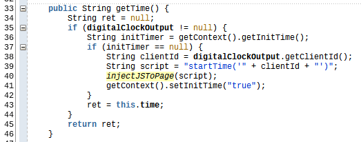
In the getTime() method we first check if the bounded component is already set (line 35), then we get the flag from the DigitalClockContextBean, check if the flag is null. In this case, we get the clientID from the bounded component and inject the JavaScript function call to the startTimer(…) method with the clienID.

One other point is how to get the DigitalClockContextBean inside the DigitalClockBean. For this we use a managed property

This makes the DigitalClockContextBean available in the DigitalClockBean. All we need to do is to add a getter for the DigitalClockContextBean and a variable to store the value

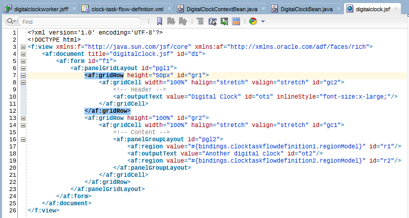
Now we can test the task flow by adding it multiple times to a page (line 17 and 19)

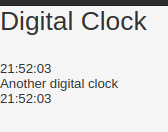
This will get us this output

You can download the sample application from GitHub. It was created using JDeveloper 12.2.1.4 and don’t use a DB.

JDeveloper: af:query hide fields from ‘Add Fields’ button

A couple of weeks ago a question in the Oracle ADF Community asked for help with af:query in advanced mode. In detail, the user wanted to know how to hide some fields from the ‘Add Fields’ LOV available in the advanced mode of the af:query component.

You can hide fields declaratively in the view criteria the af:query. For this, you uncheck the queryable checkbox for the attribute. If you do this for e.g. the CommissionPct attribute

You don’t get this field when you click on the add button

But you don’t see the field also.

A field that is hidden this way cant be used in the query.

Use Case

The use case is to hide the field only from the list of fields to add. This is useful if you only want the field in the query once.

Solution

A look at the documentation reveals that there isn’t any property to do this, I didn’t find one at least.

The solution that I’m showing here is to use CSS to hide the field from the list that is built by the af:query component when you click the add fields button.

How to find what to hide?

Well, before we can hide something with CSS, we need to find out what to hide. First thing to try is to use a skin selector. However, when I looked into this, I did not find any skin selector that could be used for this. All selectors available for the af:query component are used for different things.

Before we start looking into skin and or CSS, we disable content compression to see the real selector names by setting a context parameter in the web.xml file

When we run the application after that, we can use any browsers development tools and look at the generated HTML code (here I use Chrome):

The blue marked part shows the markup for the ‘Email’ in the popup of the ‘Add fields’ button. The task is to hide this EMail from the add Fields list but to let it be available in the list of fields on the left.

Now that we found the right element, we can hide it simply by setting the CSS

display : none;

to it.

Well, it’s easy to do in the browser development tools, but how to do it in the application?One way would be to create a skin selector for the class

‘af_commandMenuItem af_commandMenuItem-menu-item’

but this would change all components using this skin.

My solution is to add the CSS directly to the JSF page using an af:resource tag like

The trick is to use CSS to address the right element. You can look up all available selectors e.g. at w3schools.com.

We are looking for a tr element that has a specific id and can use the selector shown in line 6 in the image above.

Running the application with this CSS added to the page results in

The Email field is still present once, but it can’T be added again as it is not visible in the list of fields to add.

The one disadvantage using this technique is that we have to specify the element by its name. This is not dynamic but a fixed value. Ich you add another query to the page you gen another id and you have to change the CSS.

In the end, it’s your decision if you use this technique, but I guess it is a valid one for this special use case.

You can download the sample application from GitHub. The application was built using JDeveloper 12.2.1.4 and uses the HR DB.

JDeveloper 12.2.1.4: responsive af:panelFormLayout

One of the new notable features in JDeveloper 12.2.1.4 is an extension to the af:panelFormLayout component that allows a responsive behavior of the component.

af:panelFormLayout before 12.2.1.4

The image above shows the typical af:panelFormLayout. Actually we see two af:panelFormLayout:

  1. At the top, we see an af:panelFormLayout where we can alter the layout with the af:selectOneChoice. This we use to investigate the new setting
  2. The one at the bottom that just shows the old af:panleFormLayout without any change. This is just there to better see the difference

In the image above both look the same. There is no responsiveness in either panelFormLayout. If the browser window gets smaller than the needed size for the two columns you get

We see that the label now takes two rows, but the inputText components in the second column are clipped.

Changes for 12.2.1.4

JDeveloper 12.2.1.4 added a new property ‘layout’, that changes this behavior to make the component more responsive to changes in the width of the window size.

The new property can have one of three possible values:

  1. Weighted: this is the default. It will size the panelFormLayout to the size to the content and then break the labels if the space gets too small.
  2. Fixed: will size to the width of the screen and truncate the labels and fields
  3. Responsive: will auto arrange the fields in multiple columns and manage labelAlignment based on the space available for the panel

Weighted layout

As this is the default layout (and the only one before 12.2.1.4) we skip this here.

Fixed layout

The image above shows the difference between ‘fixed’ layout (top part) and ‘weighted’ layout (bottom part). Reducing the width of the screen will result in

Still not what we call responsive.

Responsive layout

OK, let’s look at the ‘responsive’ property. If the container width if big enough, it almost looks like the ‘fixed’ layout (see image below).

When the width is reduced the labels are arranged above the input field, which quite an improvement over the weighted layout.

When the width is reduced further, the multi-column layout is reduced to a one-column layout

By default, ADF defined three points or width where the layout changes. These points are defined in the skin and can be changed by altering the skin

af|panelFormLayout {
  -tr-panel-size-sm: 768;
  -tr-panel-size-md: 1024;
  -tr-panel-size-lg: 1281; /* anything greater than this is xl */
}

If you need different points where the layout should change, you can easily change the skin and define different style classes for different scenarios.

The sample was built using JDeveloper 12.2.1.4.0 and can be found at GitHub under BlogResponsivePanelFormLayout.

JDeveloper 12.2.1.4: Exposing Custom Methods from ADFbc ViewObjects to REST API

The new JDeveloper version 12.2.1.4 brought some changes to the ADF business components REST features. One of the features I wondered about is how to expose custom methods built in a view object to the REST API. The release documentation at (https://docs.oracle.com/en/middleware/developer-tools/adf/12.2.1.4/develop/whats-new-this-guide-release-12c-12.2.1.4.0.html#GUID-F0E4CCC6-5419-4FFD-B2F3-E29B40A487DB) says

What does this mean?

The REST part in the documentation still shows some pictures showing the ‘Custom Method’ tab for a REST resource

However. Searching the documentation for ‘custom method’ doesn’t show any result.

Defining a public custom method in the employee’s view and adding it to the client interface (only then methods are visible from the outside)

Looking at the same dialog in JDeveloper 12.2.1.4 does not show the ‘custom method’ tab 😦

So, is the documentation correct?

NO, a hint from @JDeveloper in a tweet gives a hint on this.

Methods are exposed by default!

But how to find them?

Well, let’s try the ‘describe’ operation on the VO using the URL ‘http://127.0.0.1:7101/BlogAdfRestMethod-RESTWebService-context-root/rest/v0/Employees/describe’. This will return plenty of information about the REST API. There we find the information about the Method ‘getVersionInfo’ which I wrote as a custom method in the EmployeesViewObjectImpl class.

To see the method in the REST API, the method must be part of the client interface. This is what the tweet means by ‘updating the metadata’, I guess.

Now, to call the method we use a POST request with the content type set to ‘application/vnd.oracle.adf.action+json’ as noted in the description of the method. The body of the POST request is set to

{
    "name" : "getVersionInfo"
}

Sending the request will give us

I added another method to the EmployeesViewObjImpl method

Named ‘sayHello’. This method I did not expose to the client interface. As we see in the description, this method is not exposed in the REST API. After exposing the method to the client interface too, we get this method in the REST API too.

Now, the description lists

So, the new method can be called via REST too

You can download the sample application from GitHub BlogAdfRestMethod. The sample was built using JDeveloper 12.2.1.4 and uses the HR DB schema.

JDeveloper 12.2.1.4: af:chooseDate

The new JDeveloper 12.2.1.4 has added an enhancement an a new feature to the af:chooseDate component. We are looking at both in this article.

Enhancement

The enhancement is that you can now set a default date which is shown as the selected date when the field you show the af:chooseDate for is empty. In the older JDeveloper versions, the selected date was always the current date. The image below shows the situation of how the af:chooseDate component looks like:

The af:inputText ‘Datum’ is not set and because of this, the af:chooseDate shows the current date (when I took the picture) as the selected date. Problem is, that there are use cases where you don’T want the current date to be the selected date, e.g. your use case might want to show the next Friday after the current date as the selected date. This was not easily possible.

Now, the enhancement to the af:hcooseDate component allows us to set a default date via the property ‘defaultValue’. When set to a literal value, this will be parsed as “yyyy-MM-dd hh:mm:ss” or “yyyy-MM-dd”.

I added an af:inputdate ‘Set DefaultDate’ to allow selection of a date which then will be used as the default date in the af:chooseDate for the ‘Datum’ field. The current date is marked with gray and the date set in the ‘Set Default Date’ is shown as the selected date.

As you see, the ‘Datum’ field is still empty. If you select a date like ‘12/20/2019’ you get

Sample Code

<af:inputDate label="Set Default Date:"
     Nhn ng  value="#{bindings.defaultDate1.inputValue}" id="id2"
     autoSubmit="true"/>
<af:spacer id="s1" height="10px"/>
<af:panelGroupLayout id="pgl2" layout="horizontal">
<af:inputDate label="Datum" id="id1" chooseId="cd1"/>
<af:chooseDate id="cd1"
    defaultValue="#{bindings.defaultDate1.inputValue}"
    partialTriggers="id2"/>

New Feature: “Multiple Date Selection”

The af:chooseDate component has another feature added. Now you can select multiple dates at once. This feature is very handy as you can now use one af:chooseDate to get a start date and an end date or date ranges. The image below shows the component with multiple dates selected.

The interesting thing is, that there is no implementation for this hardcoded in the component. Meaning is that we, the developers, need to implement this feature ourselves. For this ADF provides two new client events ‘load’ and ‘dateSelection’ that are triggered by the af:chooseDate component. We use these client events to implement the multi-select feature. The load event can be used to pass an array of dates to the component which are then shown as selected. This event is triggered when the component loads, as the name implies. The dateSelection event is triggered each time a user selects a date. It passes information about the keyboard state so that we can handle range selection.

To make it easier, the ADF Rich Client Demo has a sample implementation of the needed JavaScript code which I used as the base of my implementation:

/**
 * Shows a popup from an "action" type event.
 * @param {AdfActionEvent} actionEvent the event being handled
 */
var dates = [];
var minDate;
var maxDate;

function dateSelectionEventHandler(event) {
    var eventSource = event.getSource();
    var selectedDate = event.getSelectedDate();
    var modifier = event.getModifiers();

    if (modifier.indexOf(AdfRichChooseDate.MULTI_SELECTION) !=  - 1) {
        dates.push(selectedDate);
    }
    else if (modifier.indexOf(AdfRichChooseDate.RANGE_SELECTION) !=  - 1) {
        if (!minDate || (minDate.getTime() > selectedDate.getTime())) {
            minDate = selectedDate;
        }
        if (!maxDate || (maxDate.getTime() < selectedDate.getTime())) {
            maxDate = selectedDate;
        }
        var timeDiff = Math.abs(maxDate.getTime() - minDate.getTime());
        var diffDays = Math.ceil(timeDiff / (1000 * 3600 * 24)) + 1;
        dates = []
        for (var i = 0;i < diffDays;i++) {
            var selDate = new Date(minDate.getFullYear(), minDate.getMonth(), minDate.getDate() + i, 0, 0, 0, 0);
            if (!eventSource.isDisabled(selDate))
                dates.push(selDate)
        }
    }
    else if (modifier.indexOf(AdfRichChooseDate.SINGLE_SELECTION) !=  - 1) {
        minDate = null;
        maxDate = null;
        dates = []
        dates.push(selectedDate)
    }
    eventSource.setSelectedDates(dates);
}

function chooseDateLoadEventHandler(event) {
    var eventSource = event.getSource();
    eventSource.setSelectedDates(dates);
}

function processSelectedDates(event) {
    component = event.getSource();
    AdfCustomEvent.queue(component, "processSelectedDates", 
    {
        payload : dates
    },
    true);
    event.cancel();
}

There are three JavaScript funtions:

  1. dateSelectionEventHandler(event) handles the selection of one or more dates
  2. chooseDateLoadEventHandler(event) handles the inital load of hte component and allows us to set dates as selected
  3. processSelectedDates(event) is the funtion which passes the selected dates to a server event

The functions are added to the af:chooseDate compponent as client listerner

<af:chooseDate id="cd2" clientComponent="true">
    <af:clientListener type="dateSelection" 
        method="dateSelectionEventHandler"/>
    <af:clientListener type="load" method="chooseDateLoadEventHandler"/>
</af:chooseDate>

To pass the selected dates to a server event a button is used like

<af:button text="Selected Dates" id="b2">
    <af:clientListener method="processSelectedDates" type="action"/>
    <af:serverListener type="processSelectedDates"
        method="#{viewScope.ChooseDateBean.procressSelectedDates}"/>
 </af:button>

The image below shows the selected dates once the button ‘Selected Dates’ is clicked.

This JavaScript function simply passes the array of selected dates as payload from the client to the server. There the dates are just stored in a bean variable. This variable is used to show the dates in an af:outputText.

The same works for a range selection as shown below

And after the button ‘Selected Dates’ is clicked we get

The sample can be downloaded from GitHub BlogChooseDate or directly as a zip. The sample is written using JDeveloper 12.2.1.4 and doesn’t use any DB connection.

JDeveloper 12.2.1.4: af:panelTabbed

The new JDeveloper 12.2.1.4 provides some new features and enhancements. In the next couple of posts we are going to investigate some of them.

We start with the af:panelTabbed component. There is an enhancement fro this component we all waited for a long time. Vertical stacked tabs with icons and text. This sounds like a small thing, but in earlier versions of ADF vertical stacked tabs could only show icons.

We are calling tabs vertical stacked, if the tab is on the left or right side of the panel. Horizontal stacked tabs are the ones at the top or the button of the panel.

Vertical Stacked Tab with Icons and Text

As said before, in earlier versions of ADF you needed to do a workaround to get tabs on the left or right showing an icon, text or both. You needed to create an icon from the icon, Text or icon with text and add it to the af:showDetailItem. The drawback was that you couldn’t just edit the text (e.g. correcting a spelling mistake) or had to generate different such icons for different languages along with some logic to exchange the icon according to the selected language.

The new af:panelTabbed has a new property ‘verticalTabMode‘ with two modes:

  • iconOnly this mode behaves like the old versions and only shows an icon defined for the af:showDetailItem
  • iconAndText this mode shows an icon and the text defined in the text property of the af:showDetailItem
af:panelTabbed with verticalTabMode=”iconOnly’
af:panelTabbed with verticalTabMode=”iconAndText’

The images above show the af:panelTabbed with the new verticalTabMode. The sample application for this can be downloaded from GitHub BlogPanelTabbed. It does not use a DB connection and was built using JDeveloper 12.2.1.4.

JDeveloper 12.2.1.4.0: First Impressions

27th Sep 2019, the new JDeveloper version 12.2.1.4.0 became publicly available. We waited two years for the latest version. Is this version worse waiting for it?

In the next couple of blogs, I go through some of the new features offered. Before I start with the new features, I summarize my findings.

The list of fixed bugs available from https://www.oracle.com/technologies/developer-tools/jdeveloper/12214rn.html is impressive. However, some of the bug descriptions are not descriptive without knowing the actual case. Anyway, I found many bugs I filed for 12.2.1.x versions. You should read through the list, and you’ll find that some bugs which you have run into have been fixed in 12.2.1.4.

When 12.2.1.4 became available the documentation about what has changed or which features have been added, was thin, very thin. In the last couple of weeks, this documentation became available too. Some broken links have also been corrected. You should look at the JDeveloper homepage (https://www.oracle.com/technologies/developer-tools/jdeveloper/jdeveloper.html) regularly and search for new documents. Some other users and I ask support and the product management to add documentation which we found missing. Oracle support and product management reacted very fast and provided everything we asked for within a couple of weeks.

I’m using JDev 12.2.1.4 for four weeks now regularly. My impression is that the IDE is more stable. I do see some exceptions in the IDE, but the IDE keeps running. Older versions of the IDE (12.2.1.3, 12.2.1.2 and 12.2.1.1) sometimes crashed (once a day). It no fun to lose small parts of your latest changes. 

One defect (see https://community.oracle.com/thread/4299239) is reproducible in 12.2.1.4 too. This problem, while old, has just filed as an SR to support.oracle.com. Let’s hope Oracle can fix it ASAP.

I don’t see a significant performance gain in my daily work. Starting the integrated WLS takes a bit longer on my test machine. I’m running it on a LINUX system (Ubuntu 18.04 with 8GB RAM and JDK 1.8.0_221, 4 CPUs) in a VirtualBox. For me, it looks like the minimal configuration you can work on. I can work fine, but it’s not cutting edge. I don’t have to wait too long for audits or insights. I know it becomes better with more resources. In the next couple of months, I’ll move the installation to a better setup with more memory and more CPUs. 

The first task, as usual, was to create a new ADF Fusion Web Application, add some business components from DB tables and build a small UI with the created objects. As I said before, the list of fixed bugs is impressive. However, making this first application, I found new problems. 

The wizard used to build ‘Business Components from Tables’ doesn’t obey all the package names specified. The ApplicationModule package is simply ignored. It’s not a big deal, as you can refactor this easily. If you specify the package names globally (Tools->Preferences->ADF Business Components->Packages) it works OK. Another problem using this wizard is that an application module is generated, even if you deselected the option for this. This problem is known in the community (I learned that other users have this problem in older JDev versions), but it seems unknown to Oracle. Maybe nobody filed an SR for this. I submitted an SR for this now.

Migrating some of my projects to 12.2.1.4 (from 12.2.1.1, 12.2.1.3) worked smoothly. All applications I wrote from my blog articles (12c only) migrated without a problem. I could run all of them too.

One problem I run into is using Maven as a build tool for ADF applications. There were problems using Maven as a build tool in old 12c JDeveloper versions. Oracle fixed a lot of bugs regarding Maven. While testing Maven again in 12.2.1.4.0 I found most of the older bugs fixed, but I found a new one. I can’t say that they fixed all Maven bugs as the newly found bug prevents the complete test. Running JUnit test for business components from Maven doesn’t work. Somehow the fixture used to create the application module can’t create the JDBC connection because the credentials can’t be found or are wrong. Oracle is investigating this problem. For now, Maven testing is stalled.

The next thing I tried was installing the Rich Client Demo on my test machine. The last time I tried this (for 12.2.1.1) this process was laborious. Once you had installed the demo all you could do was running it. There is a new description of how to install the demo on your client machine (https://www.oracle.com/technetwork/developer-tools/adf/documentation/adf-faces-rc-demo-083799.html). This description isn’t perfect as you need to add two more libraries (‘ADF Model Runtime’ and ‘apache-commons-lang-2.6’), but it’s simple to follow. The client demo runs on my test installation. I can even change things (or debug it). I’m not sure if this was possible for older version, I simply can’t remember the last time I tried to do this.

I found some other small problems which I disclose in one of the next blogs when I start to show some of the new features or enhancements of JDeveloper 12.2.1.4.0

I expected to find some problems. Some of them are stupid or embarrassing. Still, I like the new version. Keep in mind that I did not mention all the good stuff which works OK.  

JDev 12c: Multi Line Button

An interesting question came up in the JDeveloper & ADF ODC space. A user asked how to display a button which shows a long text in multiple lines.

The image above shows an af:button with a longer text. If you don’t have enough space in your layout to show such a long text in a button, you can shorten the Text. If this is not a acceptable, one solution is to break the long text into multiple lines.

Think about an af:panelSplitter which should show the same button

but the space i for the left pane in the splitter s limited. The result will be that the text of the button can’t be read. In other layouts the button might overflow the given space. his can crumble your whole page layout.

In this blog I’ll show you how to design a button which can handle this situation by showing the text in multiple lines. The green dotted rectangles shows the size of the layout container. This is for information only.

As you see in the image above, the text of the button breaks into multiple lines if the space is not wide enough to show it in one line. If we move the splitter to the right you see the effect

Solution

The solution is to create a style class for the button which we use for button which should be able to show their text in multiple lines. This style class is put into a skin to make it available to the ADF application.

.multiLineButton af|button::text {
    white-space: normal; 
}

The usage of the style class is simple as we see in the sample code for the af:panelSplitter

<af:panelSplitter id="ps1" splitterPosition="100" orientation="horizontal" dimensionsFrom="parent">
	<f:facet name="first">
	        <af:button text="This Button has a very long text to show" id="b3"/>
        </f:facet>
        <f:facet name="second">
                <af:button text="This Button has a very long text to show" id="b4"
                           styleClass="multiLineButton"/>
        </f:facet>
</af:panelSplitter>

You can download the sample BlogMultilineButton (or the zipped workspace) from GihHub. The code was developed using JDeveloper 12.2.1.3 and doesn’t use a DB connection.

Update: InputNumberSpinbox without Spin inside af:query

A user asked how to get rid of the spin buttons if the InputNumberSpinbox is used in an af:query component?

Whenever you have a number attribute in a VO and use it in a view criteria which you then use to show an af:query using this view criteria, the af:query uses an af:inputNumberSpinBox in the query panel to allow the user to enter values. The problem is, that you can’t control how the components rendered inside an af:query is rendered. There are no properties you can change which are available if you use the same component directly.

af:query with af:inputNumberSpinBox and spin buttons

Using the af:inputNumberSpinBox in the af:query has the same advantage as I mentioned in the original post.

And the same disadvantage too. In most cases, you don’t want or need the up/down buttons to select a number. Well, this can be done by adding the same style class we added to the af:numberInputSpinBox to the af:query component. The result can be seen in the below image

And we get the same behavior inside the af:query component too.

The reason this works is, that the af:query uses an af:inputNumberSpinBox in the query panel. The skin selector we used in the skin file works for the af:numberInputSpinBox too.

As you see, if you select the af:query in the skin file and hover over the spin button, it tells you which selector is used. This is the same selector we use in our skin file

I added another sample which I extended from the original one build with JDeveloper 12.2.1.1.0. This sample uses the HR DB schema and can be downloaded from GitHub BlogInputSpinBoxWithoutSpinV2

InputNumberSpinbox without Spin

ADF offers a wide range of components which allow user to input data. There is a build in intelligence which chooses the ‚right‘ component for the given data type when you create the UI from a data control. This allows e.g. to create a form to input data which e.g. covers the basic formatting and error handling of the data types for the given fields.

From my point of view, one wrong decision is to use the af:inputNumberSpinbox for Integer and BigInteger data types. Setting a bigger number using the spin boxes isn’t working for most people, at least not for me.

The spin buttons are of no real use in most cases. In some versions of JDev the buttons are skinned too small so that it’s hard to use them at all. There are some cases, when the range of numbers is minimal, where using the spin buttons is OK.

What I like about the component is the build in error handling if I try to input anything but a number

without doing anything to the component. This is the code used for the above image

<af:inputNumberSpinbox label="Spinnumber" id="ins2"
    value="#{bindings.myNumber21.inputValue}"/>

As you see there in nothing but the component, still we get the right error message.

You can get the same result by using a normal af:inputText with an included af:numberConverter, but you need to know how to do this:

<af:inputText label="Number in af:inputText" id="it1"
    <af:convertNumber type="number" id="nc1" pattern="0"/>
</af:inputText>

This doesn’t look identical but close enough. One difference to note is that the af:inputText starts the input on the left whereas the af:inputNumberSpinbox aligns the numbers to the right. You can change this too with setting more properties on the component.

For this I like to use the af:inputNumberSpinbox without the spin buttons.

To make the af:inputNumberSpinbox usable I get rid of the spin buttons:

The component works like hte one with the spin buttons but look like a normal inputText

This can be done by changing the skin. If you like it can be done globally or you define a custom skin class and add this class where you don’t want to see the spin butons:

.nospin af|inputNumberSpinbox::incrementor-icon-style {
    display: none;
}

.nospin af|inputNumberSpinbox::decrementor-icon-style {
    display: none;
}

The ‘.nospin‘ is the name of the custom style class you can use on the af:inputNumberSpinbox to turn the spin buttons off.

Here is the part of the page

<af:panelGroupLayout id="pgl2" layout="vertical" inlineStyle="padding-left:20px;">
    <af:inputNumberSpinbox label="Number" id="ins1" value="#{bindings.myNumber1.inputValue}" styleClass="nospin"/>
    <af:spacer width="10" height="30" id="s1"/>
    <af:inputNumberSpinbox label="Spinnumber" id="ins2"
        value="#{bindings.myNumber21.inputValue}"/>
    <af:spacer width="10" height="30" id="s2"/>
    <af:inputText label="Number in af:inputText" id="it1">
       <af:convertNumber type="number" id="nc1" pattern="0"/>
    </af:inputText>
    <af:spacer width="10" height="30" id="s3"/>
    <af:button text="Submit" id="b1"/>
</af:panelGroupLayout>

You can download the sample from GitHub BlogInputSpinBoxWithoutSpin. The sample was built with JDeveloper 12.2.1.1.0 but should work with other versions too. There is no DB used or needed to run the sample.